Parkgate Society
Community Spirit
A modular identity system greater than the sum of its parts
Brand identity, graphic standards, website, print & digital collateral
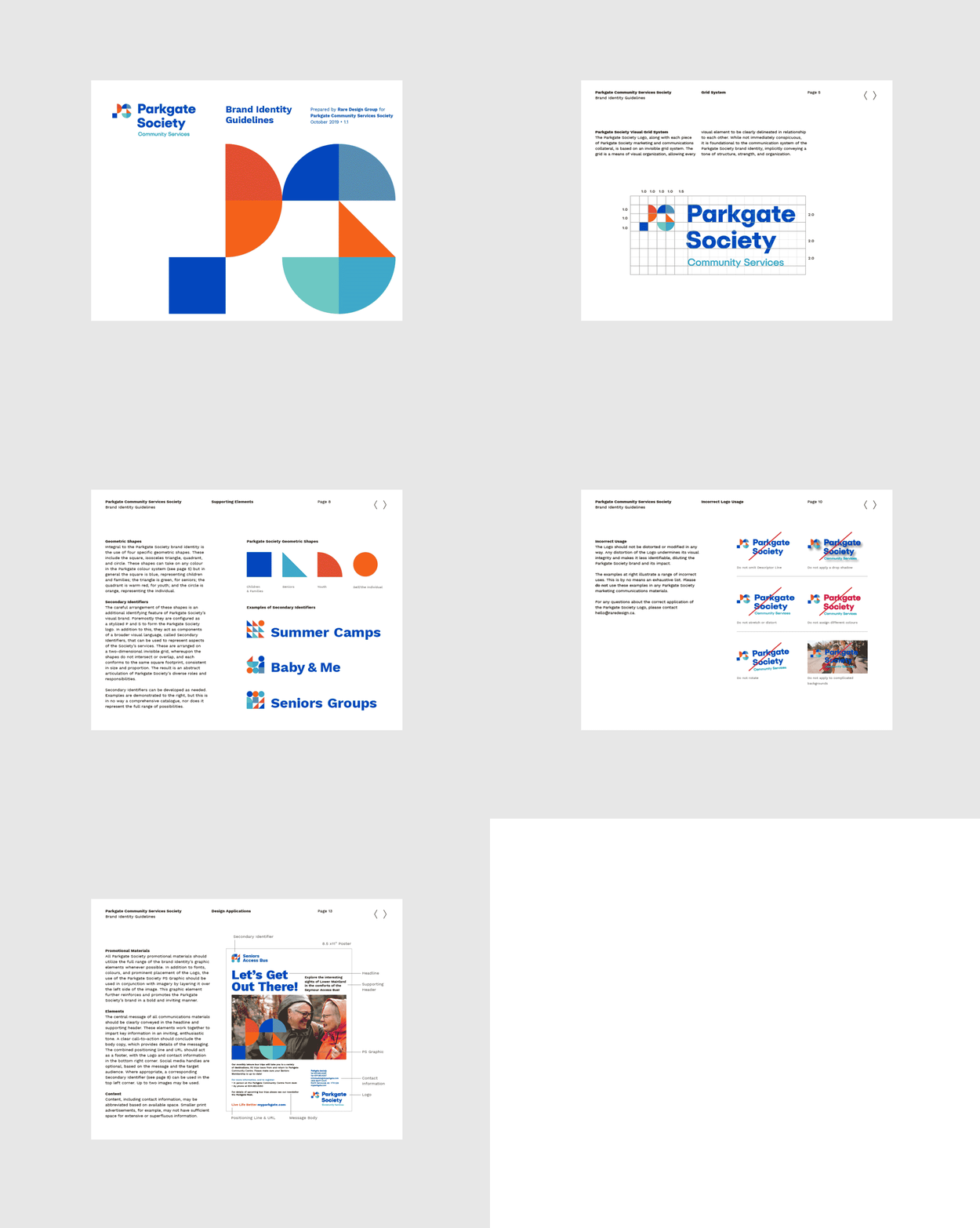
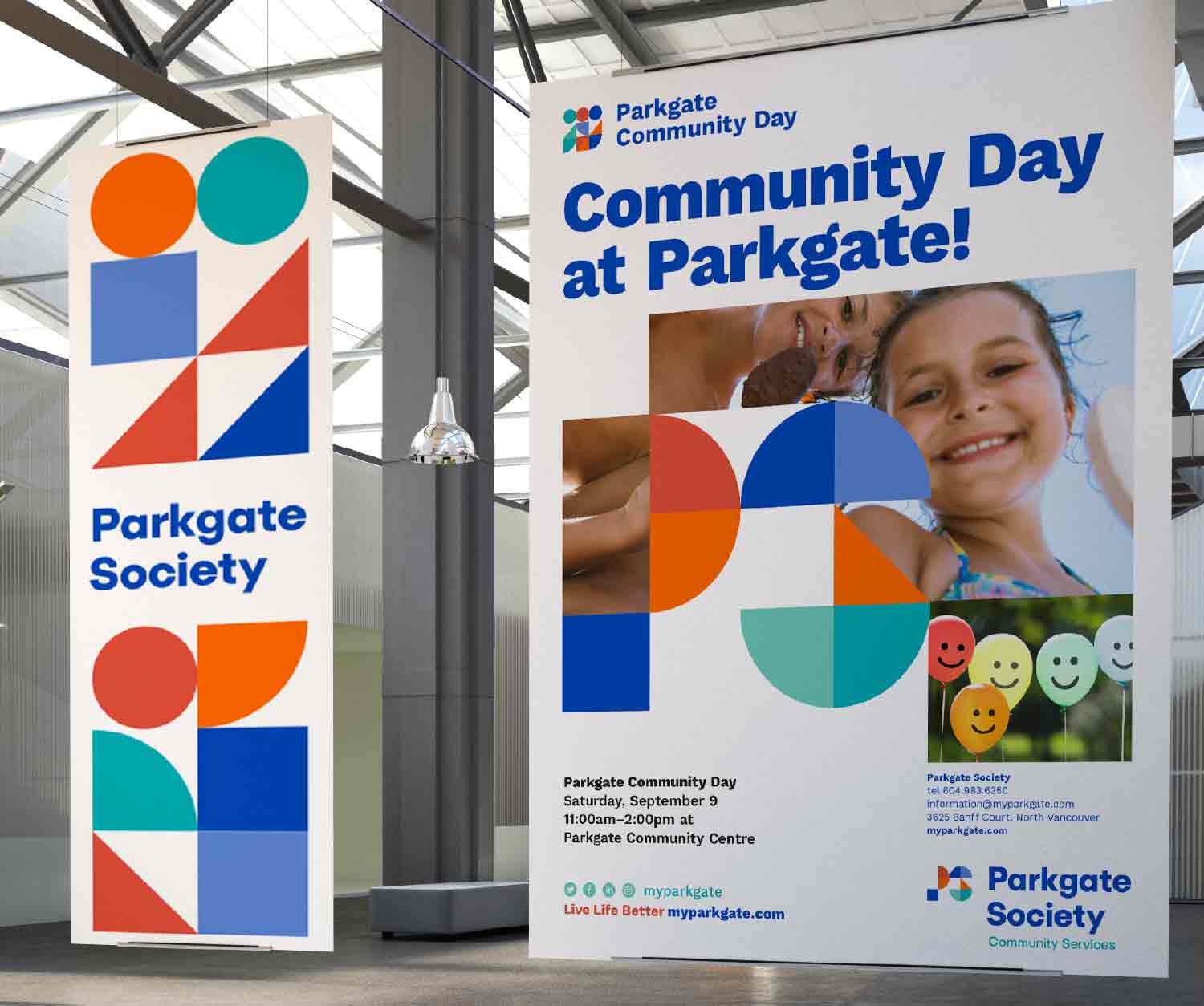
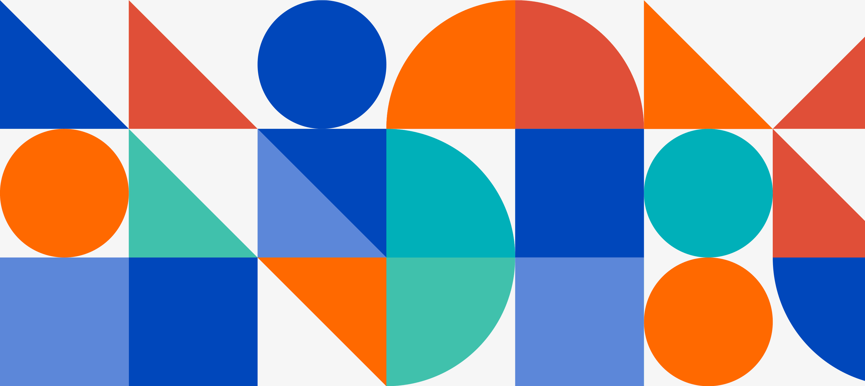
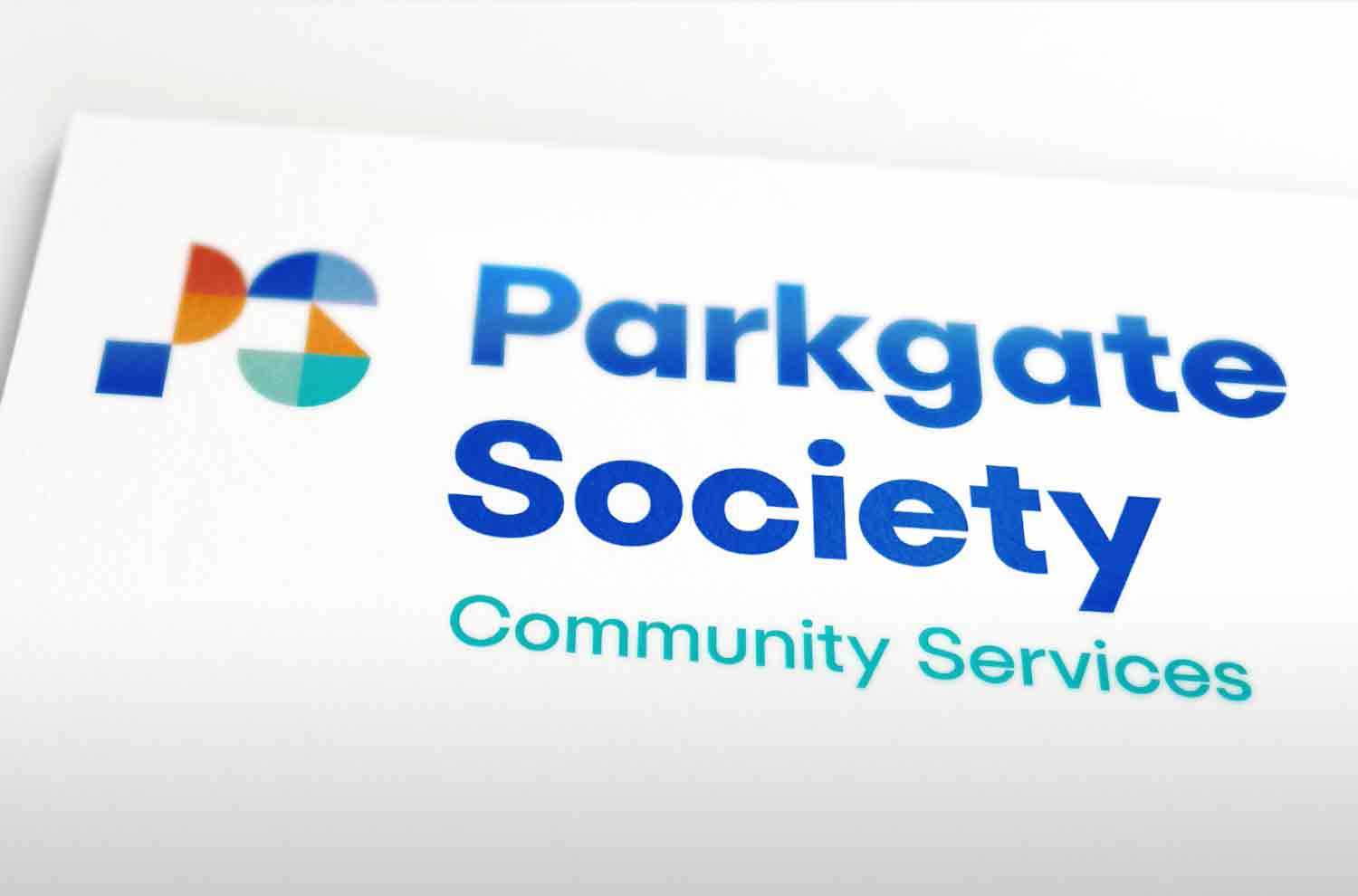
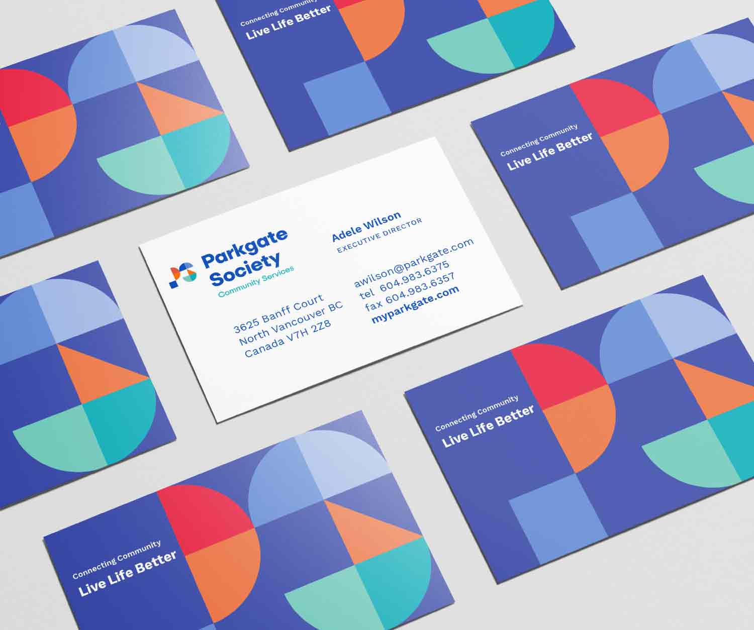
Since 1983, Parkgate Society has provided community based programs and services out of Parkgate Community Centre and other satellite locations along Vancouver’s North Shore. To reflect the diversity of its community, Rare developed a modular system of geometric shapes comprising the logo. These further extend to create an endless array of patterns meant to represent the fabric of a healthy, cohesive, and vibrant community, with each shape representing the groups served by Parkgate: Families (square), youth (circle), children (quadrant), and seniors (triangle).
MODULAR VISUAL SYSTEM
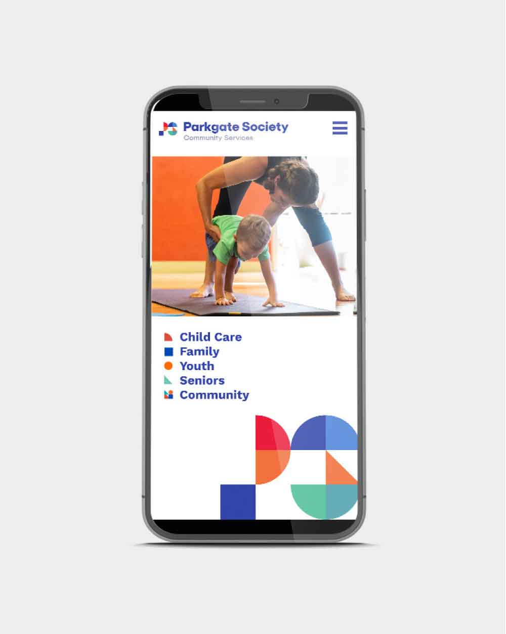
As well as reflecting the diversity of community, the geometric forms are arranged to create pictograms that serve to identify Parkgate’s various programs and services. In the same way a community benefits from the involvement of each of its members, the result is an identity system that is enabled and elevated by each individual component.
WEBSITE
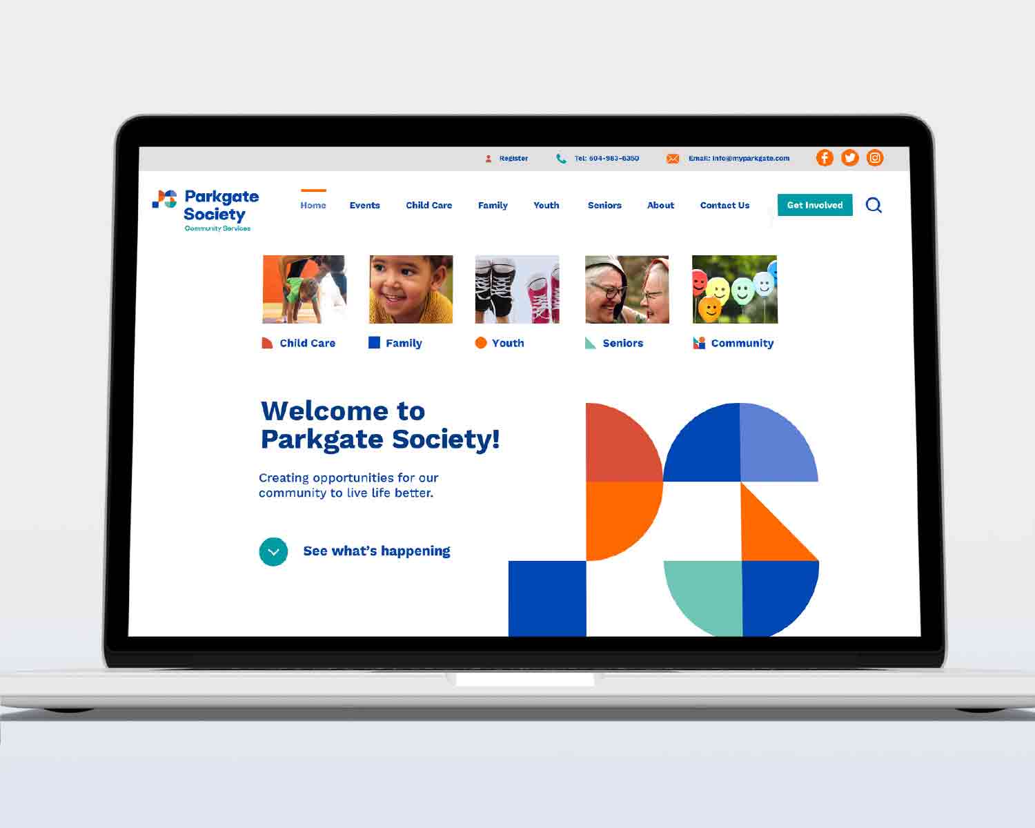
Rare rebuilt the website from the ground up, creating a consolidated, more intuitive architecture and a user-first interface that fluidly directs visitors to their relevant programs.
