Looking Glass Foundation for Eating Disorders
A Healthy Reflection
Revealing the values of Western Canada’s largest not-for-profit disordered eating organization
Brand identity, website, graphic standards, print & digital collateral
Over twenty years ago, Looking Glass Foundation opened its doors to individuals and families suffering from the devastating effects of eating disorders. Since then, having successfully treated thousands of individuals, it is among the most highly-regarded resources in North America for this still largely misunderstood disease.
To overcome this hurdle, Rare Design Group initiated a brand audit whose outcomes led to the creation of a refreshed brand identity based on the Foundation’s stated values that have guided its ethos and practices from the start.
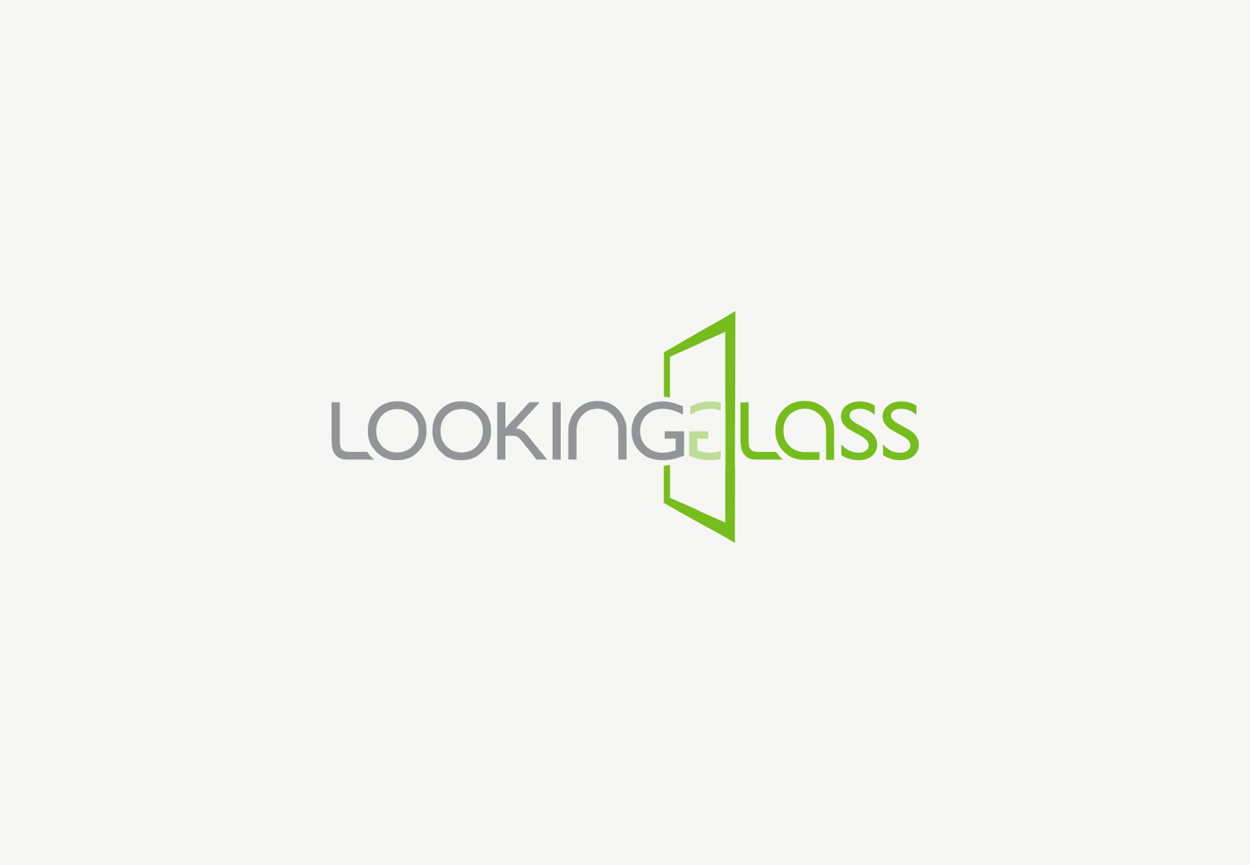
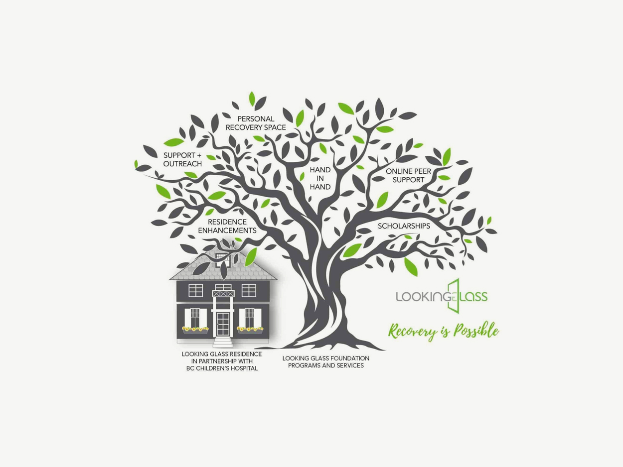
Old Logo
New Logo
Brand Identity
This ‘back to basics’ approach began with a simplified, more restrained interpretation of the logo. A classic, modernized typeface replaced an overstylized, futuristic wordmark, and the mirror graphic was replaced with a simple vertical line. Identified as ‘the Portal,’ this line represents the threshold of transformation, separating two specific points on a trajectory toward wellness: before and after, there and here, then and now.
Visual Language
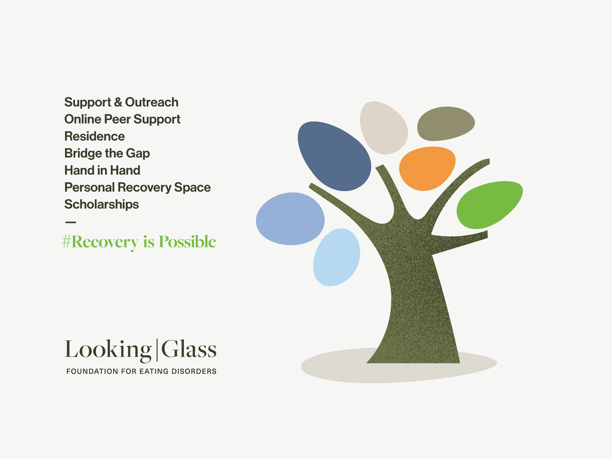
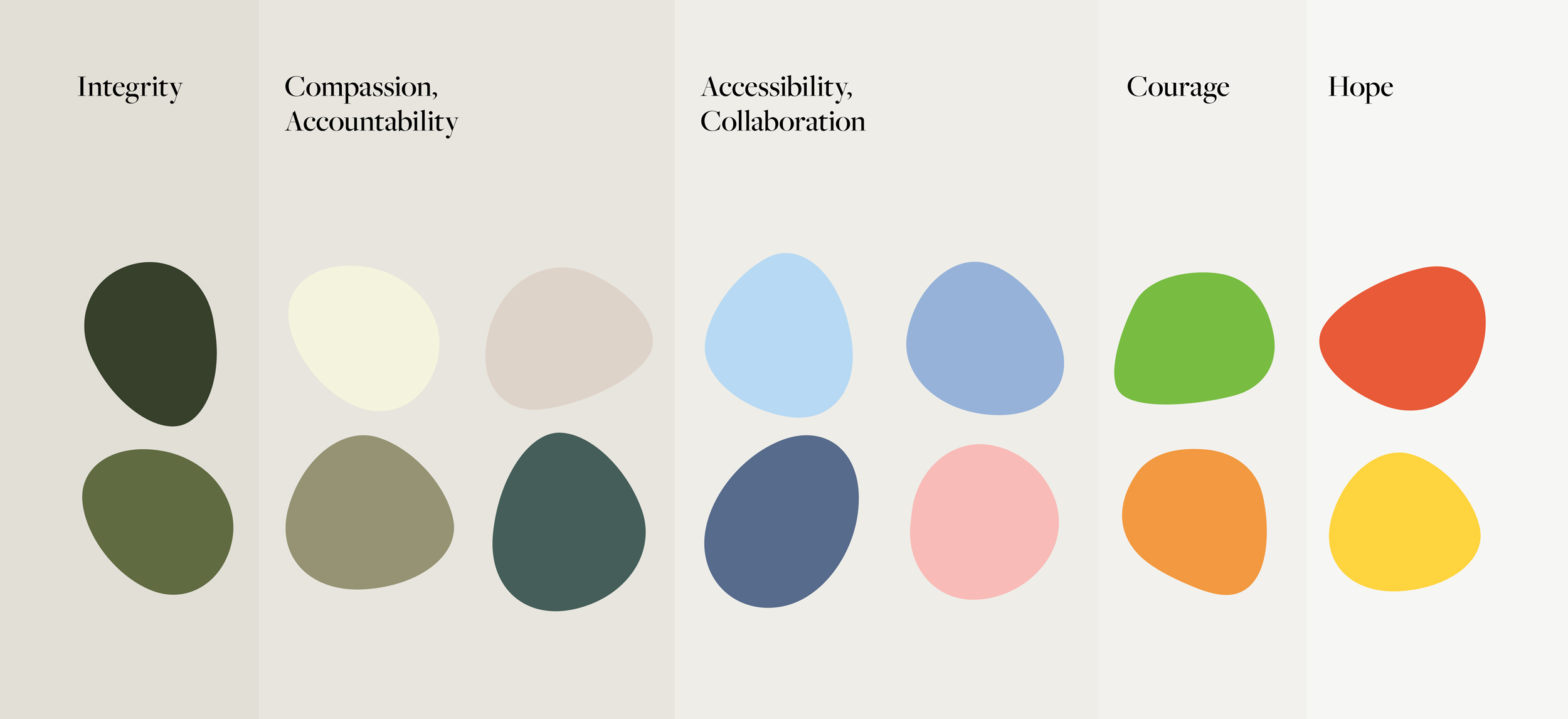
The brand identity at once embraces this idea of personal growth and transformation and reinvents it, reverse-engineering the concept of the brittle, fragile state of a mirror into its essence: a stone, but one that has been transformed by experience and time into a smoothed, organic, inherently strong element. From glass to molten rock to its original organic state, the weathered stone is a symbol of strength, natural resilience, and transformation.
Upon creating a library of organic stone shapes, Rare developed a colour system to encompass and emphasize the Foundation’s values: Integrity, Compassion, Accountability, Accessibility, Collaboration, Courage, Hope.
The Composite
Sub-Brands
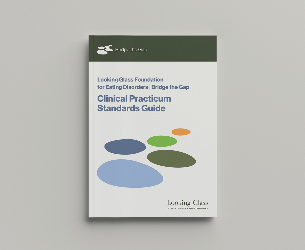
These graphic elements and colours are arranged and manipulated to create visual identifiers for Looking Glass Foundation’s various programs, each distinct from the other yet consistent within the overarching brand identity.
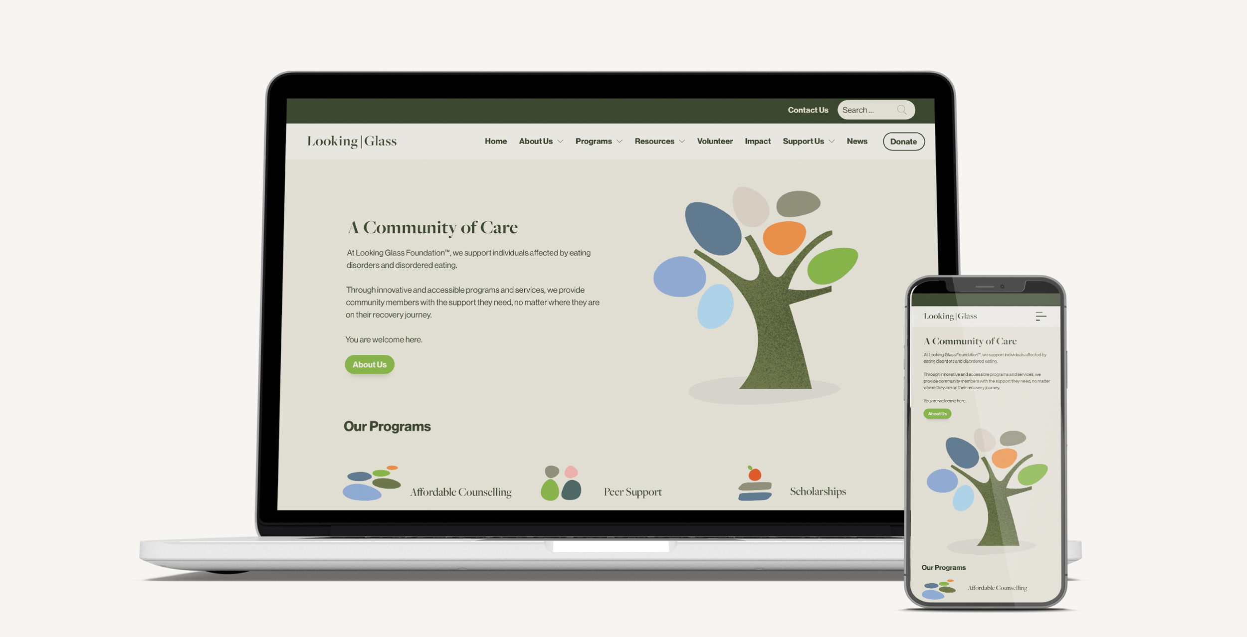
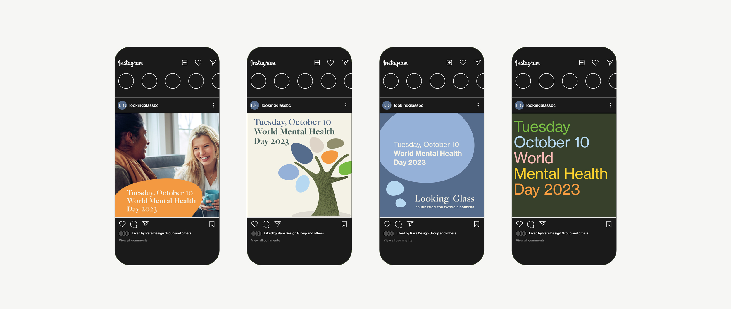
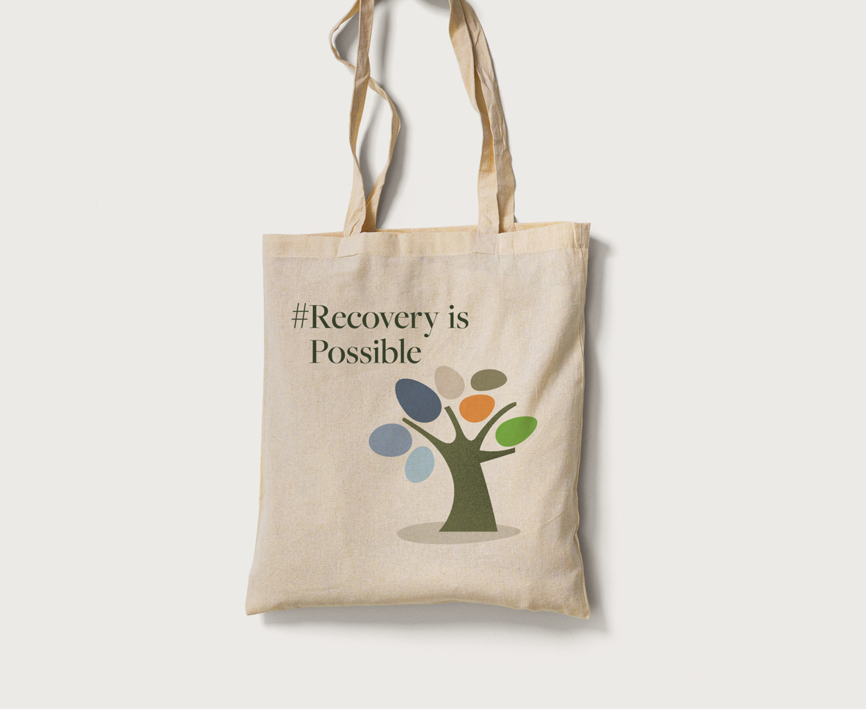
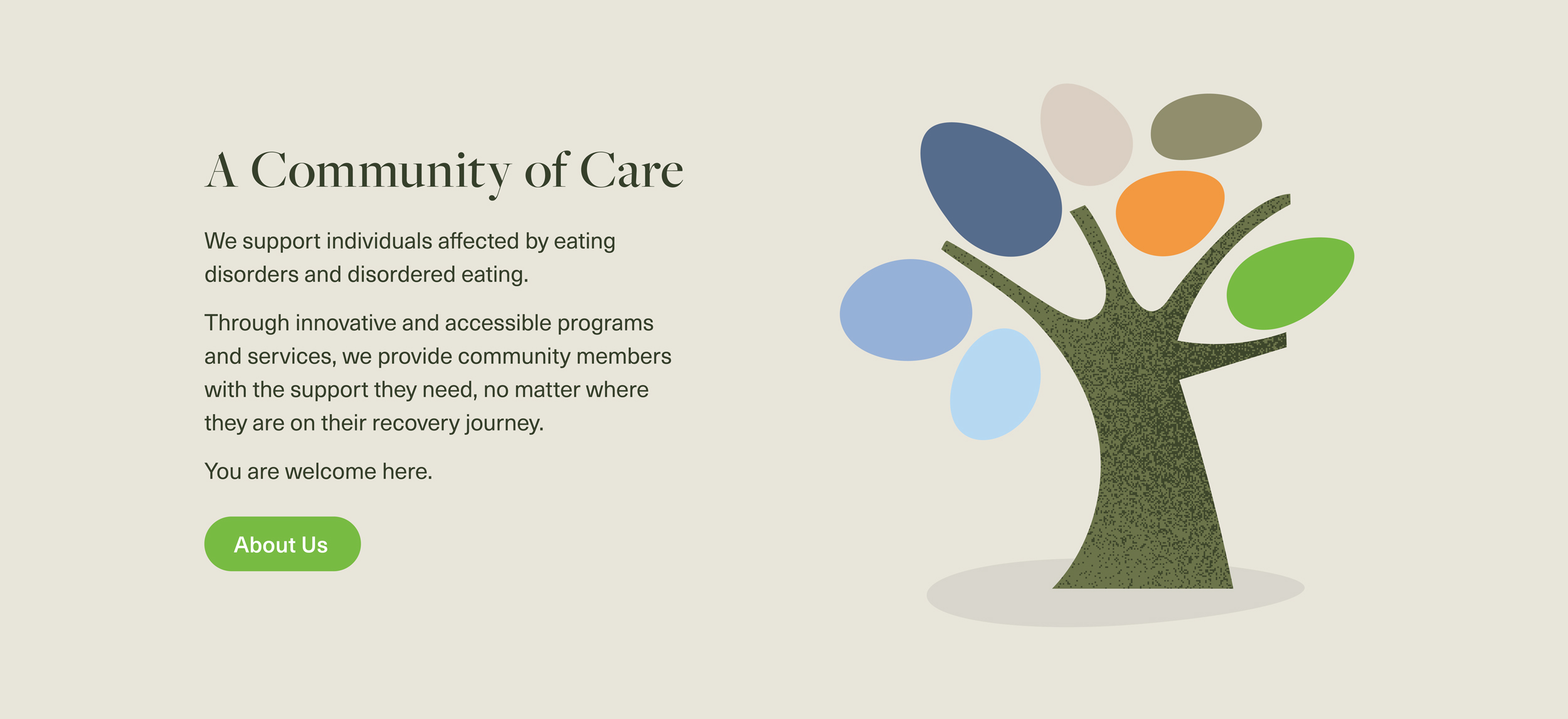
This visual language further extends to the Foundation’s signature graphic, a stylized tree representing the programs and services offered, as well as the website, social media graphics, and marketing and corporate communications materials.
